Visual Identity Development for “Sabrinox”
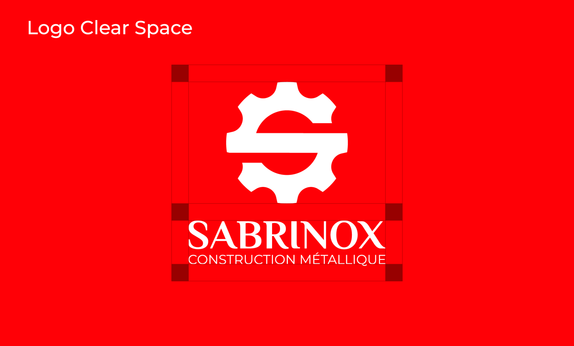
Our collaboration with “Sabrinox” was dedicated to the complete development of their graphic identity. This encompassed the creation of a graphic charter, defining safe zones, conceptualizing a distinctive logo, selecting typography, and establishing a cohesive brand color palette. The goal was to craft a visual identity that not only represents “Sabrinox” but also resonates with their target audience, making a memorable and impactful impression.
Key Highlights:
- Graphic Charter: We meticulously designed a graphic charter, ensuring consistency and uniformity across all brand assets.
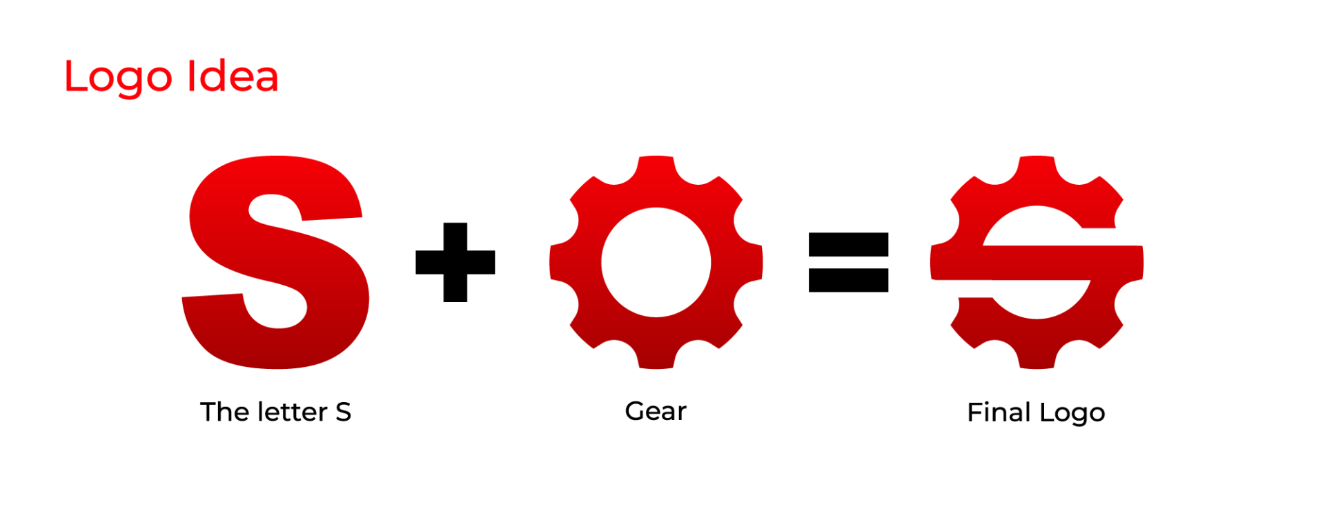
- Distinctive Logo: The conceptualization of the logo was a focal point, with the aim of making it a symbol of recognition and trust.
- Typography Selection: Careful consideration was given to typography, aligning it with the brand’s character and values.
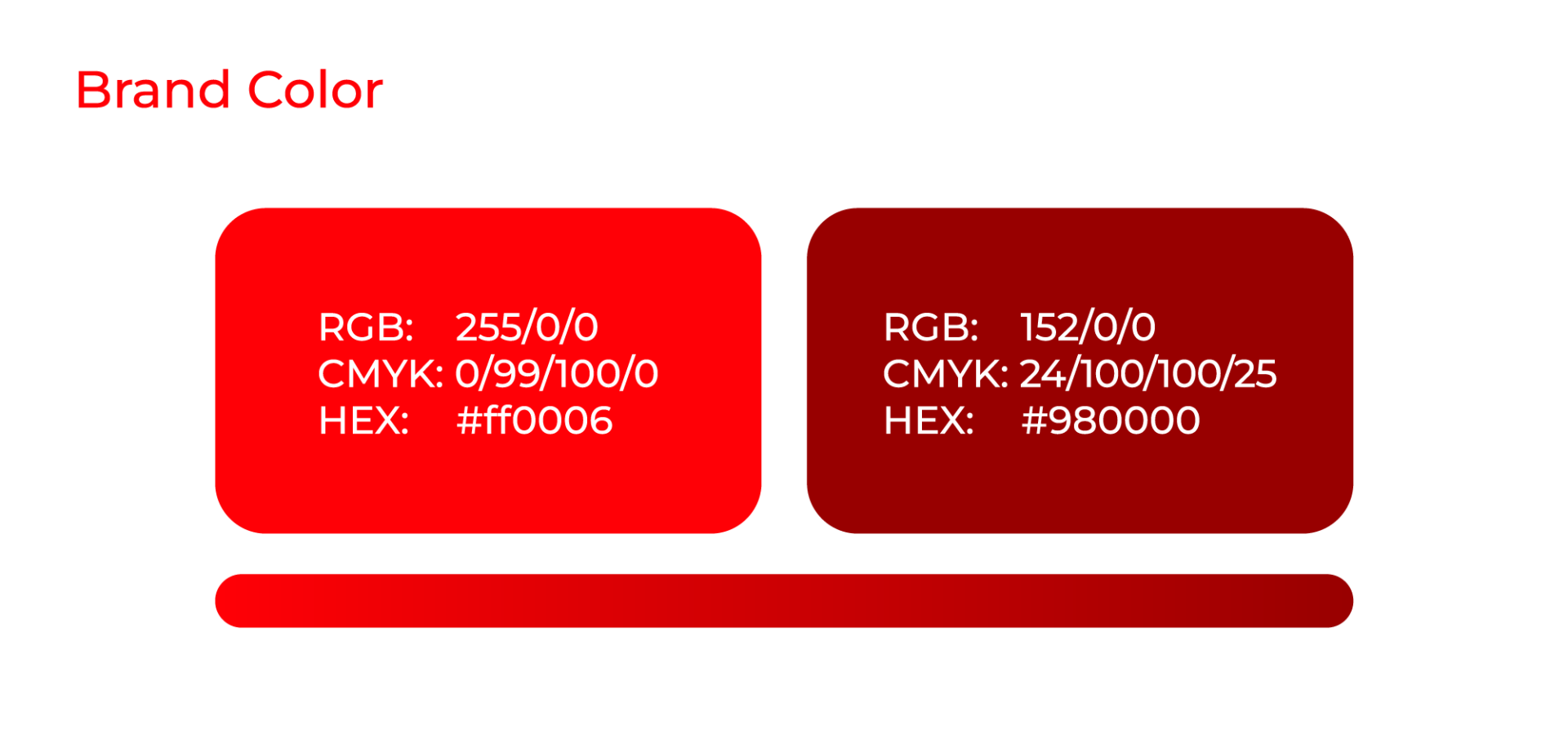
- Brand Color Palette: The establishment of a cohesive color palette played a pivotal role in conveying the brand’s personality and establishing recognition.
- Enduring Impact: The resulting graphic identity not only represents “Sabrinox” effectively but also ensures a lasting and memorable presence in their industry.
Task
Our objective was to establish a distinctive and memorable graphic identity for "Sabrinox" through the creation of a graphic charter, logo, typography, and brand color palette. The goal was to ensure a strong, lasting brand presence and resonate effectively with the target audience.


